Users
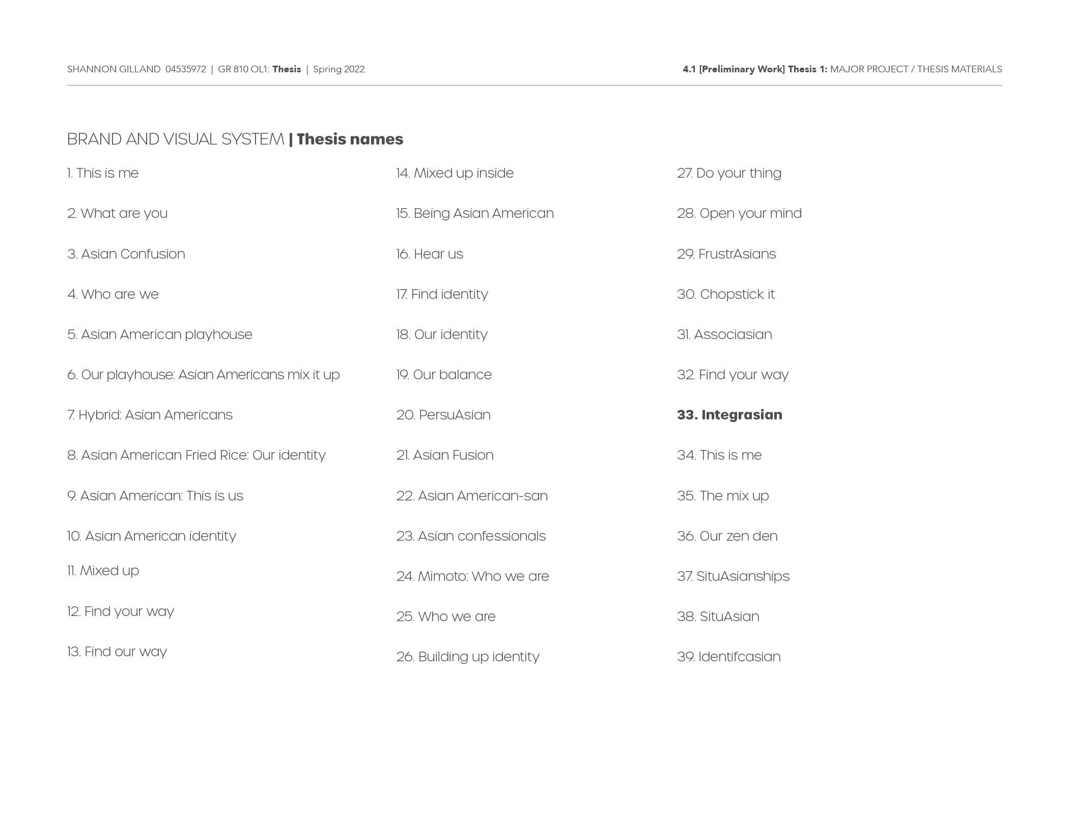
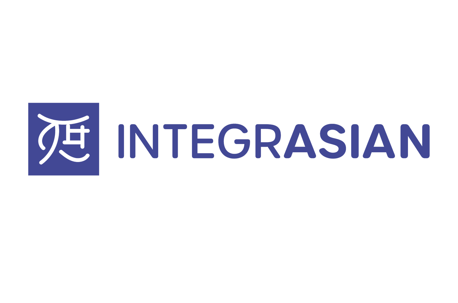
TThis week I decided to work on the name more. I researched names and meanings and came up with two that would work well with my thesis. Associasian and Integrasian. After further research and recording a friend pronouncing each name, I decided on Integrasian. I combined the words Integration (the process of uniting different things) and Asian together and came up with the name Integrasian. I wanted something to connect all of the different Asian cultures together. This name works the best.
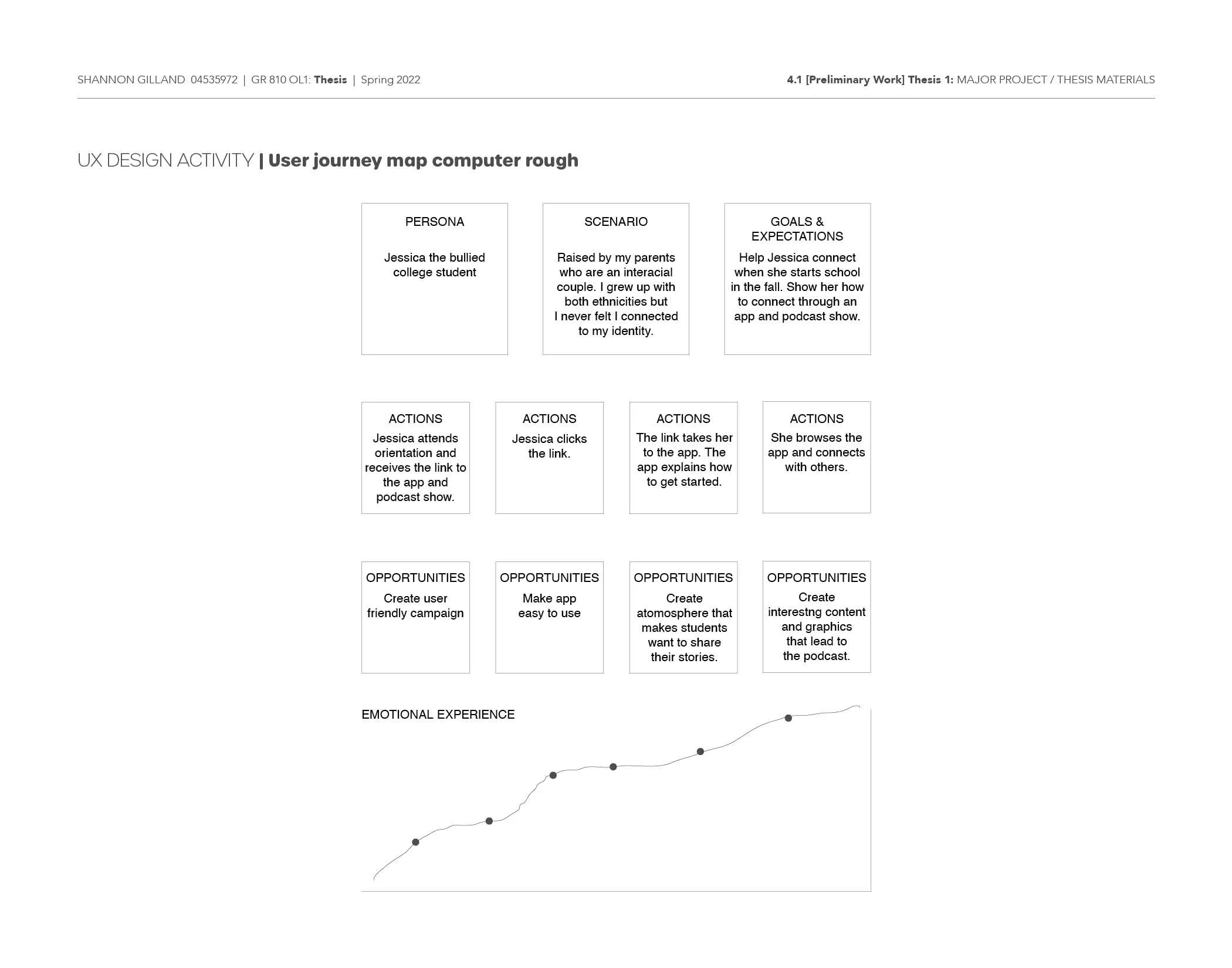
My inspiration this week was the Japanese woodblock stamp. I did more research on the stamp and found out that some Asian cultures use this stamp as their signature. They are made out of ivory or wood and come in a square or circle. I took the letter "I" for Integrasian and played with the negative space to create a woodblock stamp. For the shape I used a square. I wanted the negative space and "I" to feel like they're integrating with each other. I need to explore this option more. I explored several typefaces. I looked at different color palette options that would relate to my target audience. For the app I sketched out a user flow chart showing how to sign up and how the app functions throughout. When I starting creating the computer draft of the user flow chart I realized I needed to edit it. I made it less complicated and easy to navigate.
For next week I will explore and create computer roughs using a circle to create a woodblock stamp look. Since I focused mainly on the name and logos this week I will add examples of type, layout and design to my moodboards on the next submission round.