User Experience Map
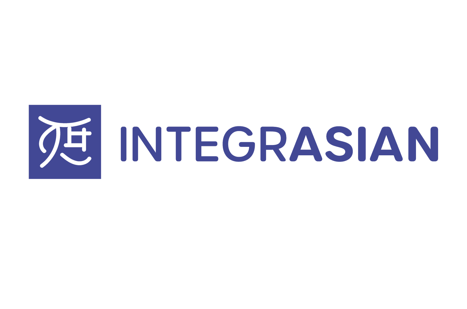
This week I decided to work on expanding the logo further. I created different variations. I played around with each logo in black and white, 1 color and 2 color. I did more research on the stamp and explored kanji letter forms. The first variation mimics a kanji symbol. I created the symbol so it would show the integration of the logo. For the second variation I was inspired by hiragana and katakan characters that look different than Kanji symbols. The third version was created to show a modern monogram. I merged a kanji symbol with the modern monogram together to create a new idea. The last version was inspired by the woodblock signature stamps. I made the logo mimic a stamp. This idea was my least favorite. I would have to work on the execution more and further develop it. For all four logos I experimented creating vertical and horizontal layouts. For the font choice I'm leaning towards is Urbane Rounded. I feel it works the best for my project so far. I will continue to explore more fonts and colors. I started creating some elements and patterns and will create more next week. For the next weeks brainstorming I contacted a few students that will meet with me in person to work with post-it notes and give feedback.